Figma landing page teardown: what to change
Figma scores 69/100 on PageLint's quick copy audit — a mixed result — strong in places, leaky in others. Clarity is the stronger lens at 73/100, while Trust trails at 66/100. The biggest issue the engine flagged: “Social proof signals” (TR-3, high severity).
What to change
- 1 · TR-3 · highSocial proof signals
No testimonials, logo strip, or usage stats detected
Add at least one form of social proof: customer testimonials, company logos, or usage numbers.
Cialdini, Influence, Ch. 4 (Social Proof)
- 2 · CL-6 · highSingle message focus
The page presents at least five distinct CTAs leading to different destinations or decisions: 'Build and ship products,' 'Figma Slides Co-create presentations,' 'Config 2026 Join virtually June 24–25 for free,' 'User groups Join a local Friends of Figma group,' and 'Get started.' These are not aligned to a single conversion goal — they span product adoption, a separate product (Slides), a conference event, a community program, and a generic onboarding flow. A first-time visitor faces a meta-decision: which of these is for me?
For a homepage targeting new visitors, establish one dominant CTA ('Get started' or 'Try Figma free') and demote or relocate event/community links to a secondary navigation area or footer. Figma Slides should be surfaced as a product feature within the main flow, not as a competing top-level CTA. Apply the 'one page, one purpose' principle: every element should support the primary conversion goal.
Ogilvy, 'Confessions of an Advertising Man' (1963): 'A good advertisement is one which sells the product without drawing attention to itself' — fragmented CTAs draw attention to the navigation decision rather than the product value.
- 3 · TR-6 · highObjections handled near CTA
The primary CTAs visible on the page are 'Get started' and 'Build and ship products'. No objection-handling signals are present anywhere in the page content — no 'no credit card required', 'cancel anytime', 'money-back guarantee', 'free plan', 'SOC 2', 'GDPR', 'no setup fee', or '14-day free trial' language is found in the body text, section headings, or social proof digest.
Place at least 2 objection-handlers directly adjacent to the primary 'Get started' CTA — for example, 'Free forever plan available' and 'No credit card required'. For enterprise-oriented visitors, adding 'SOC 2 certified' or 'GDPR compliant' near the CTA would further reduce friction and anxiety at the moment of decision.
CXL Institute anxiety lens research; Cialdini, R. (2001). Influence: The Psychology of Persuasion — reducing perceived risk at the point of commitment increases conversion.
Before → after
PageLint drafted these rewrites from the audited page text and the findings above. Treat them as proposals for Figma to test. Any claim in them must match the company’s real terms.
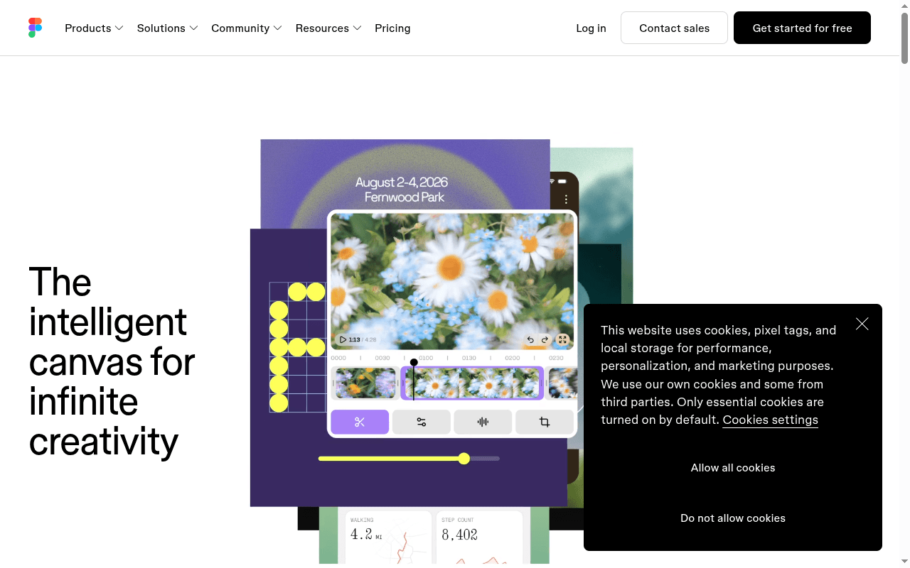
"Intelligent canvas" could be a whiteboard, an art generator, or a design tool. The rewrite names the category and audience (CL-3).
Five destinations compete in the hero (CL-6).
The audit found no social proof signal (TR-3). Use a real figure from Figma.
Expected impact
These rewrites target CL-3, CL-6, TR-3. If they ship, those checks should stop failing on a re-audit, which would lift the 69/100 score. We have not re-scored them yet and we do not claim a conversion lift, because we have no conversion data for Figma.
All findings
7 findings shown · 8 of 16 checks passing
Social proof signals
No testimonials, logo strip, or usage stats detected
Add at least one form of social proof: customer testimonials, company logos, or usage numbers.
Single message focus
The page presents at least five distinct CTAs leading to different destinations or decisions: 'Build and ship products,' 'Figma Slides Co-create presentations,' 'Config 2026 Join virtually June 24–25 for free,' 'User groups Join a local Friends of Figma group,' and 'Get started.' These are not aligned to a single conversion goal — they span product adoption, a separate product (Slides), a conference event, a community program, and a generic onboarding flow. A first-time visitor faces a meta-decision: which of these is for me?
For a homepage targeting new visitors, establish one dominant CTA ('Get started' or 'Try Figma free') and demote or relocate event/community links to a secondary navigation area or footer. Figma Slides should be surfaced as a product feature within the main flow, not as a competing top-level CTA. Apply the 'one page, one purpose' principle: every element should support the primary conversion goal.
Objections handled near CTA
The primary CTAs visible on the page are 'Get started' and 'Build and ship products'. No objection-handling signals are present anywhere in the page content — no 'no credit card required', 'cancel anytime', 'money-back guarantee', 'free plan', 'SOC 2', 'GDPR', 'no setup fee', or '14-day free trial' language is found in the body text, section headings, or social proof digest.
Place at least 2 objection-handlers directly adjacent to the primary 'Get started' CTA — for example, 'Free forever plan available' and 'No credit card required'. For enterprise-oriented visitors, adding 'SOC 2 certified' or 'GDPR compliant' near the CTA would further reduce friction and anxiety at the moment of decision.
Hero 5-second test
The intelligent canvas for infinite creativity — WHAT is unclear (an 'intelligent canvas' could be a whiteboard tool, an AI art generator, a design system, or a project management tool). WHO is not stated at all in the hero. The subhead is absent, leaving the H1 to carry full explanatory weight alone.
Rewrite the H1 or add a subhead that names the product category and audience explicitly. Example: 'The design and prototyping platform for product teams — now with AI.' The body copy below the fold ('One workspace for your entire product development process') does the job the hero should be doing — move it above the fold.
Jargon and insider terminology
Multiple unexplained technical terms cluster in the body: 'WIP to ship,' 'AI-native canvas,' 'design context,' 'codebase,' 'agents,' 'Figma Make,' 'UI kits,' 'Dev tools that take you all the way to production.' The page explicitly targets both designers AND developers ('Dev tools... Build with intention') but uses design-side vocabulary ('dial in the details,' 'design file') and developer-side vocabulary ('codebase,' 'production') interchangeably without bridging explanations. A non-technical stakeholder — a product manager or founder — who is also a plausible buyer cannot decode 'AI agents work in the same space with shared context' without prior Figma knowledge.
Add a one-sentence plain-language gloss after each technical cluster. For the dual-audience problem, consider a brief role-selector or two parallel value statements: one for designers, one for developers. At minimum, replace 'AI-native canvas' in the hero zone with a plain description of what that means in practice (e.g., 'AI that works inside your design file alongside your team').
Legal trust links
Privacy Policy found, but no Terms of Service link
Add Terms of Service link (baseline trust signal).
Testimonials match target audience
Only one testimonial is present across the entire page: 'Everyone is able to influence, inspire, and give input without ever leaving the design file. That creates a really transparent, open, and honest process throughout the whole project.' — Francisco Seiz, Senior Design Director, Code and Theory. This single testimonial does include a role and company, which aligns with a design/product team ICP, but there is only one such testimonial.
Add at least 2–3 additional testimonials from clearly identified personas matching Figma's ICP — e.g., a Product Manager at a mid-market SaaS company, an Engineering Lead at a Fortune 500, or a Founder at a startup — each with role, company type, and a specific outcome. This activates the social proof similarity amplifier: prospects trust peers who mirror their own situation.
Independent automated analysis by PageLint. Not affiliated with or endorsed by Figma. Findings reflect the public landing page as fetched on July 14, 2026 and may not match the current version.
How this was scored: 16 Clarity and Trust checks, each tied to a cited source (see all checks). No brand paid to be here. Figma can request a re-audit at [email protected]. The Full Report ($29 one-time) runs all 55 checks. The free landing page checker runs the same 16 checks on any public URL.
See how your page scores on the same 16 checks
Paste your URL and get a score out of 100, with each finding quoted from your page and the source behind the rule. About 60 seconds, free, no signup.
Compare Figma
- Figma vs Miro: landing page copy compared · 69 vs 80 for Miro
More design teardowns
- Miro landing page teardown · 80/100
- Canva landing page teardown · 69/100