Trello landing page teardown: what to change
Trello scores 90/100 on PageLint's quick copy audit — one of the strongest pages we have run through the engine. Trust is the stronger lens at 94/100, while Clarity trails at 86/100. The biggest issue the engine flagged: “Single message focus” (CL-6, medium severity).
What to change
- 1 · CL-6 · mediumSingle message focus
CTAs present on the page: 'Get Trello for free' (appears twice), 'Sign up - it's free!' (appears twice), and 'Get to know Automation' (appears once). The first four CTAs align to the same signup goal, but 'Get to know Automation' is a divergent CTA leading to a different destination (a feature education page), splitting visitor attention between converting and exploring a sub-feature.
Remove or demote 'Get to know Automation' from primary CTA prominence. If Automation is a key differentiator, integrate it as a supporting proof point in body copy with a text link, not a button-level CTA competing with the signup flow. One page, one primary action.
CXL Institute research on CTA hierarchy: pages with a single dominant CTA consistently outperform multi-CTA pages; each additional CTA reduces conversion rate by diluting decision momentum.
- 2 · CL-3 · lowHero 5-second test
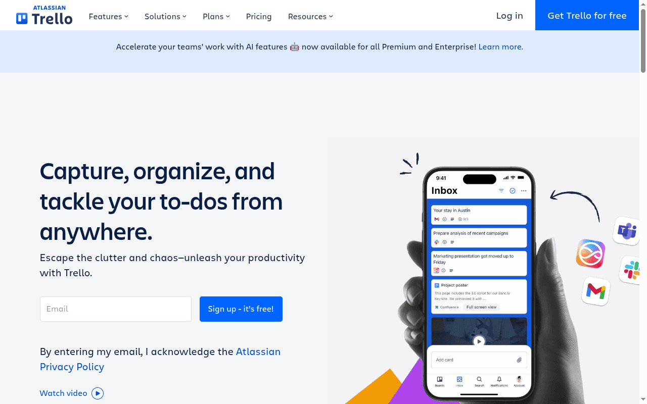
Hero H1: 'Capture, organize, and tackle your to-dos from anywhere.' Subhead: 'Escape the clutter and chaos—unleash your productivity with Trello.' WHAT is clear (a to-do/task management tool). WHO is unclear — the hero speaks to anyone with to-dos, with no signal whether this is for individuals, teams, students, or professionals. The banner 'Accelerate your teams' work with AI features' hints at teams but is a secondary announcement strip, not the hero.
Add a WHO qualifier directly in the hero — e.g., 'Capture, organize, and tackle your team's to-dos from anywhere' or add a subhead line like 'Built for individuals and teams who need to stay on top of everything.' The hero should resolve the audience question without requiring the visitor to read further.
CXL Institute, 'Landing Page Optimization' course — hero must answer Who, What, and Why within 5 seconds to prevent bounce from audience mismatch.
- 3 · CL-5 · lowJargon and insider terminology
Body copy section headers use playful internal-sounding labels: 'EMAIL MAGIC' and 'MESSAGE APP SORCERY' — these are whimsical but not jargon. The term 'mirroring of your to-dos across multiple locations' (under WORK SMARTER) is a mild technical concept used without explanation. 'Automation' appears in a CTA ('Get to know Automation') without any plain-language gloss in the hero or nearby copy. However, none of these terms cluster in the hero, and the overall vocabulary is accessible to a general audience.
Add a brief plain-language descriptor next to the 'Automation' CTA — e.g., 'Get to know Automation (set rules so Trello does the busywork for you).' Also clarify 'mirroring' with a parenthetical like 'mirroring (syncing your tasks across multiple views)' to prevent any comprehension friction in the body.
Ogilvy, 'Ogilvy on Advertising' (1983): 'The consumer is not a moron; she is your wife. You insult her intelligence if you assume that a mere slogan and a few vapid adjectives will persuade her to buy anything.' Plain language builds trust; unexplained mechanics erode it.
All findings
5 findings shown · 11 of 16 checks passing
Single message focus
CTAs present on the page: 'Get Trello for free' (appears twice), 'Sign up - it's free!' (appears twice), and 'Get to know Automation' (appears once). The first four CTAs align to the same signup goal, but 'Get to know Automation' is a divergent CTA leading to a different destination (a feature education page), splitting visitor attention between converting and exploring a sub-feature.
Remove or demote 'Get to know Automation' from primary CTA prominence. If Automation is a key differentiator, integrate it as a supporting proof point in body copy with a text link, not a button-level CTA competing with the signup flow. One page, one primary action.
Hero 5-second test
Hero H1: 'Capture, organize, and tackle your to-dos from anywhere.' Subhead: 'Escape the clutter and chaos—unleash your productivity with Trello.' WHAT is clear (a to-do/task management tool). WHO is unclear — the hero speaks to anyone with to-dos, with no signal whether this is for individuals, teams, students, or professionals. The banner 'Accelerate your teams' work with AI features' hints at teams but is a secondary announcement strip, not the hero.
Add a WHO qualifier directly in the hero — e.g., 'Capture, organize, and tackle your team's to-dos from anywhere' or add a subhead line like 'Built for individuals and teams who need to stay on top of everything.' The hero should resolve the audience question without requiring the visitor to read further.
Jargon and insider terminology
Body copy section headers use playful internal-sounding labels: 'EMAIL MAGIC' and 'MESSAGE APP SORCERY' — these are whimsical but not jargon. The term 'mirroring of your to-dos across multiple locations' (under WORK SMARTER) is a mild technical concept used without explanation. 'Automation' appears in a CTA ('Get to know Automation') without any plain-language gloss in the hero or nearby copy. However, none of these terms cluster in the hero, and the overall vocabulary is accessible to a general audience.
Add a brief plain-language descriptor next to the 'Automation' CTA — e.g., 'Get to know Automation (set rules so Trello does the busywork for you).' Also clarify 'mirroring' with a parenthetical like 'mirroring (syncing your tasks across multiple views)' to prevent any comprehension friction in the body.
Objections Handled Near CTA
The primary CTA reads 'Sign up - it's free!' and 'Get Trello for free', which implies a free plan. However, no explicit objection-handlers such as 'no credit card required', 'cancel anytime', 'money-back guarantee', 'SOC 2', or 'GDPR' appear adjacent to or within the same section as any CTA. The only signal present is the implicit free offering embedded in the CTA label itself.
Add at least one additional explicit objection-handler directly beneath or adjacent to the primary CTA — for example, 'No credit card required' or 'Cancel anytime' — to reach the 2+ threshold. Consider also adding a trust badge (e.g., SOC 2 or GDPR) near the sign-up form to reduce security anxiety.
Real Human Faces Present
Three named individuals with roles and company affiliations are present in the social proof digest: Joey Rosenberg (Global Leadership Director at Women Who Code), Sumeet Moghe (Product Manager at ThoughtWorks), and Jefferson Scomacao (Development Manager at IKEA/PTC). However, all image alt texts reference illustrations ('Illustration of a team Trello Board', 'An illustration of a list on a Trello board', etc.) and company logos, with no alt text indicating headshots or photos of named individuals.
Add real headshot photos alongside each named testimonial, with descriptive alt text (e.g., 'Photo of Joey Rosenberg, Global Leadership Director at Women Who Code') to reinforce authenticity and humanize social proof. Consider adding a founder or team section with real photos to further build familiarity.
Independent automated analysis by PageLint. Not affiliated with or endorsed by Trello. Findings reflect the public landing page as fetched on July 17, 2026 and may not match the current version.
How this was scored: 16 Clarity and Trust checks, each tied to a cited source (see all checks). No brand paid to be here. Trello can request a re-audit at [email protected]. The Full Report ($29 one-time) runs all 55 checks. The free landing page checker runs the same 16 checks on any public URL.
See how your page scores on the same 16 checks
Paste your URL and get a score out of 100, with each finding quoted from your page and the source behind the rule. About 60 seconds, free, no signup.
Compare Trello
- Trello vs Asana: landing page copy compared · 90 vs 66 for Asana
More project management teardowns
- Basecamp landing page teardown · 85/100
- Monday landing page teardown · 80/100
- Jira landing page teardown · 79/100
Related research
- The Clarity lens: 8 checks for landing pages that convert · 14 min read
- Landing page conversion statistics (2026) · 13 min read
- SaaS value proposition examples: 24 H1s ranked by clarity · 11 min read